MoMA
Museum of Modern Art (MoMA) Scatterplot
Example derived from “FiveThirtyEight: A Nerd’s Guide To The 2,229 Paintings At MOMA”1
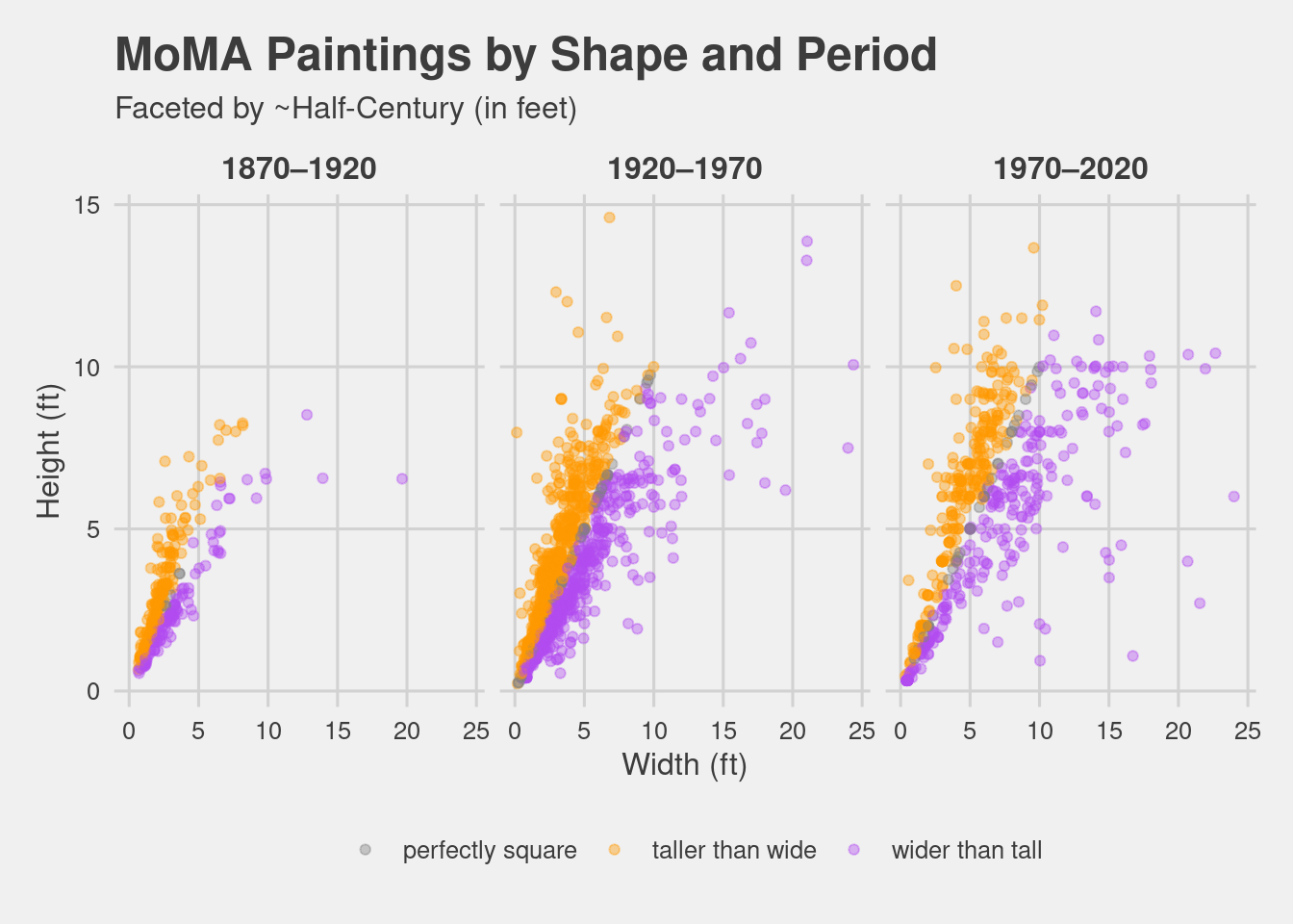
This visualization utilizes the scatterplot’s function to highlight the difference of these paired quantitative measurements (in centimeters) of the MoMA paintings: painting width and painting height. The scatterplot is a nice choice of visualization when there is a large number of data points. A major characteristic of the scatterplot is the diagonal line marking the values of x=y. This simple straight line has utility as a function to the linearity of the relationship between two variables. The assignment of a perfectly square group is a noteworthy design aspect of this scatterplot, in which the perfectly square data points create the diagonal line that separates the taller than wide and wider than tall groups. With the use of the perfectly square group, the creation of the simple straight line also functions with the application of delineating the remaining two groups. This time series set of scatterplots really illustrate that the paintings got wider and taller over time.
1FiveThirtyEight. (2016). A Nerd’s Guide To The 2,229 Paintings At MoMA. https://fivethirtyeight.com/features/a-nerds-guide-to-the-2229-paintings-at-moma/